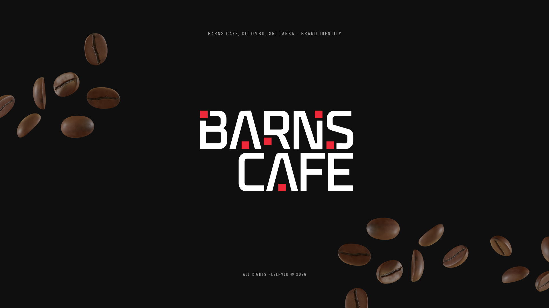
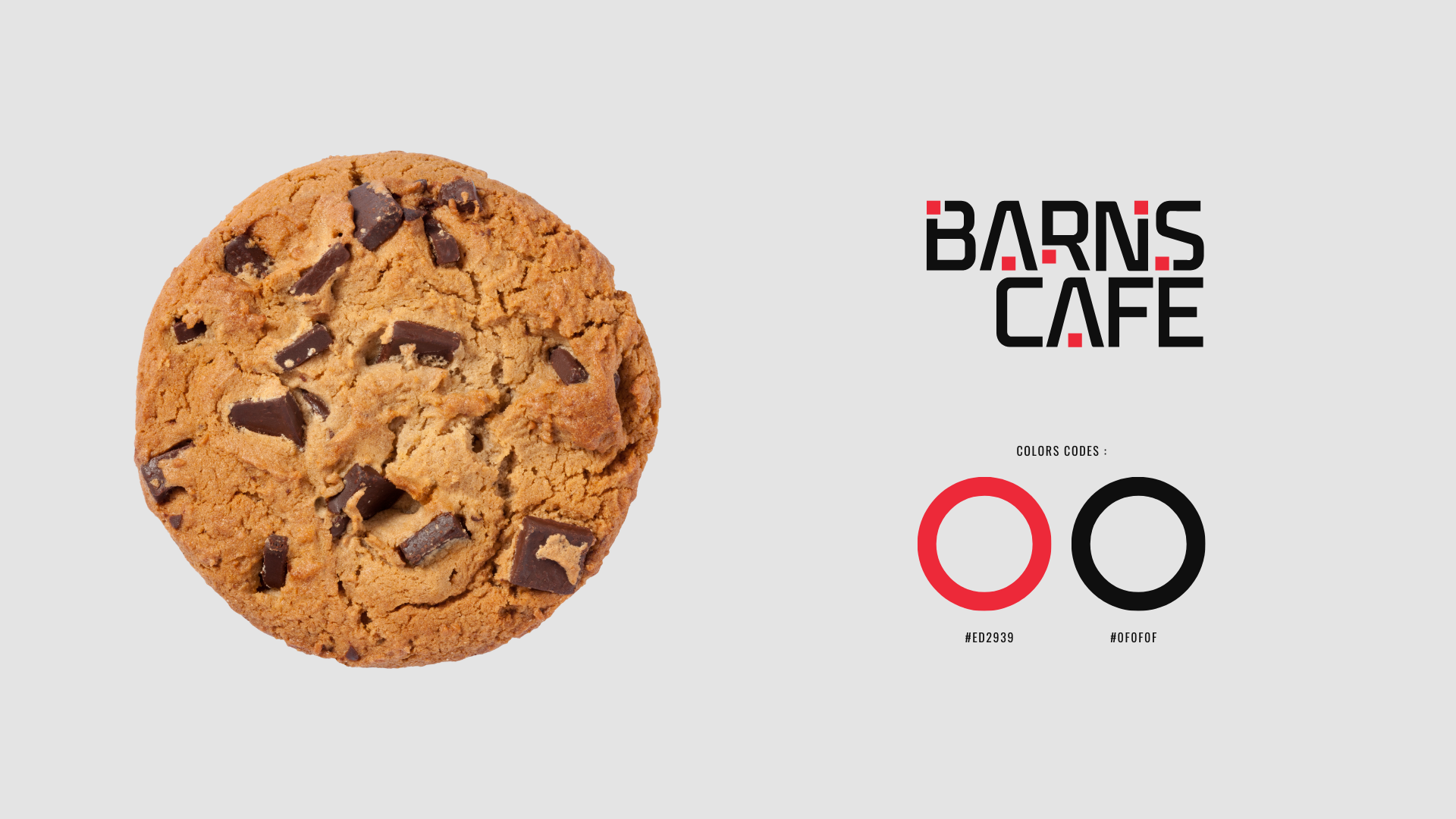
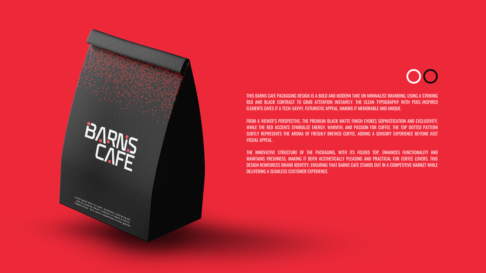
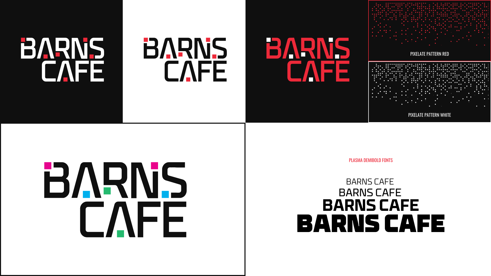
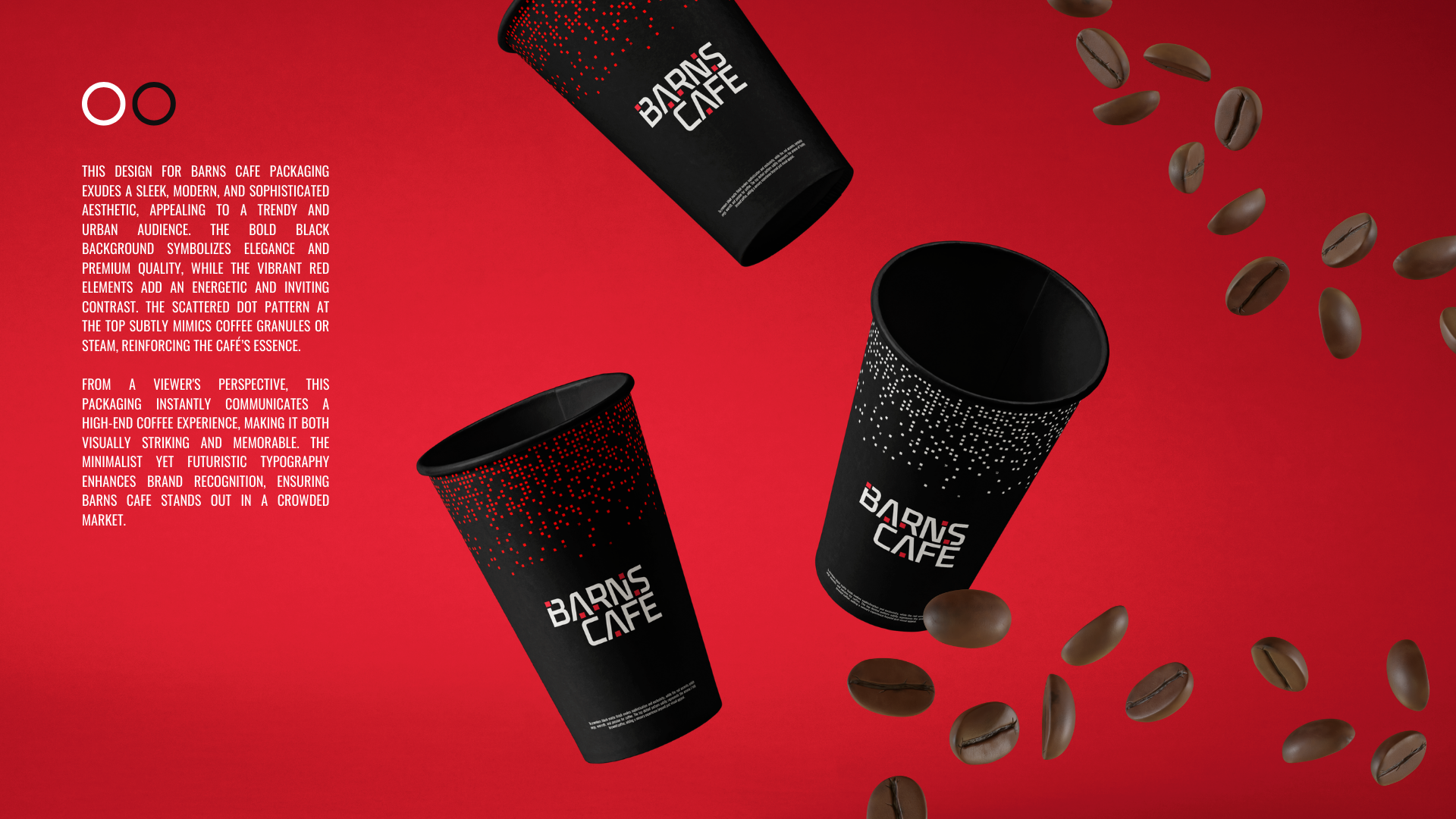
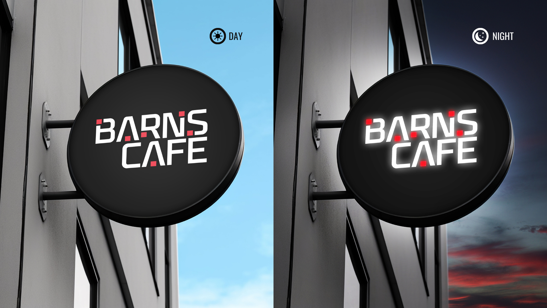
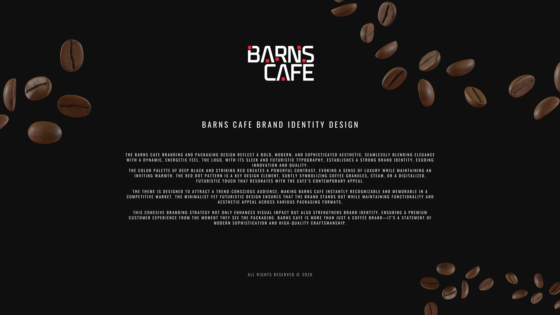
Barns Cafe's branding and packaging embody a bold, modern elegance, featuring a sleek logo that conveys innovation and quality. The deep black and striking red color palette creates a luxurious yet warm contrast, while the red dot pattern symbolizes coffee granules and adds a contemporary touch. Designed to appeal to trend-conscious consumers, the minimalist aesthetic enhances recognition and functionality across packaging formats. This cohesive branding strategy elevates visual impact and brand identity, offering a premium customer experience that reflects modern sophistication and high-quality craftsmanship.
ALL rights reserved © 2026